
Spring is foremost on our minds as we are all in the middle of winter. And despite what the groundhog says, we all want spring to be here now.
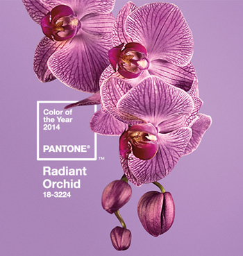
In keeping with spring, we announce what Pantone chose as its 2014 color of the year: Radiant Orchid! Pantone spokespersons describe Radiant Orchid as a "...captivating and magical purple that draws you in with its beguiling charm. An invitation to innovation, it encourages expanded creativity and originality, which is increasingly valued in our society." A pleasant harmony of fuchsia, purple and pink undertones, "...Radiant Orchid inspires confidence and emanates great joy, love and health."
Rest assured Orchid and other related purple hues will be showing up in all sorts of ways in the beauty, fashion, accessories and home industries in 2014. You're bound to see some of these interpretations:
This color will ultimately also influence product colors and packaging, especially gadgets and appliances, and even foster trends in food and beverage dressing, crafts, party and wedding themes, flower arrangements, and much more.
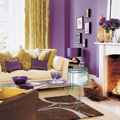
In the home decor arena, one might be more comfortable with just small doses of this color. It can be used as accents in the form of art, fabrics, and accessories (think pillows, light fixtures, accent chairs, ceramic and glass pieces). It can be soft or bold depending on what it is combined with. This hue is good for brightening up neutral palettes like grays, beiges and taupes with eye-catching punches of accent and flair. It also pairs well with olive and sage greens and is striking with teals and turquoise blues.

For the more bold homeowner, Orchid could be playful and fun as a more dominant color in the room...without being overbearing! At minimum consider an accent wall, softened by creams, golds, tans or grays in the rest of the decor. Or maybe save it for the walls of an isolated area like a work room, alcove or young girl's bedroom. Conversely, let the biggest pieces in the room (upholstered furnishings and window treatments) carry the primary color and neutralize the rest of the surroundings, or complement the purple with unexpected accent colors like blue, green, yellow and/or orange.
This softer hue of the purple family does not have to be loud and harsh; in fact, in the right proportions it can be calm and restful. So think spring by trying a touch or more of the 2014 Color of the Year: Radiant Orchid in one of your rooms.